Skip to main content
Consumer Goods & FMCG
E-Commerce
Economy & Politics
Energy & Environment
Health, Pharma & Medtech
Internet
Media
Technology & Telecommunications
Transportation & Logistics
Travel, Tourism & Hospitality
View all industries
Global data volume growth
Global AI market size
Number of generative AI users worldwide
Global inflation rate
Retail e-commerce sales worldwide
Largest economies worldwide
Biggest social media platforms by users
Global EV market share by manufacturer
International tourist arrivals by world region
Global annual CO₂ emissions
Browse recent statistics
Artificial intelligence (AI) worldwide
TikTok
Nvidia
E-commerce worldwide
Global GDP
Instagram
Apparel market worldwide
Video gaming worldwide
Global renewable energy industry
Influencer marketing worldwide
Browse recent topics
Consumer Trends 2026
Artificial Intelligence: in-depth market analysis
E-commerce challenges
Global economy
TikTok
Luxury goods: in-depth market analysis
Electric vehicles: A global overview
Video gaming worldwide
Travel and tourism trends 2026
Battery recycling worldwide
Browse recent reports
Consumer Insights
Advertising & Media
eCommerce
Consumer
Finance
Global Indicators
Health
Industrial
Mobility
Technology
Explore Market Insights
eCommerce Insights
Research AI
Book a demo
All integrations
Developer docs
Explore Statista Connect
Research
Strategy & Consulting
Marketing
Media & PR
Explore AI assistants
Marketing
Research & Development
Strategy
Sales
Find the fact
Tell the story
Win the pitch
Understand the market
Develop your strategy
Academia
Agencies
Consultancies
Consumer goods
Finance
Tech
Research solutions
Strategy consulting
Communication services
Explore Statista+
Statista R
Statista Healthcare
About Statista
First steps & help center
Webinar & training hub
Success stories
Individuals & Small Teams
Businesses & Enterprises
Academia & Government
English
Deutsch
Daily Data
Infographics on the topic "united states"
Aug 7, 2013
This chart shows renewable energy investment in 2011 and 2012 (in billion U.S. dollars).
More Information
Aug 6, 2013
This chart shows the average weekday and Sunday circulation of The Washington Post from 2004 to 2013.
More Information
Aug 6, 2013
This chart illustrates the growing adoption of social networking by adult internet users in the United States.
More Information
Aug 6, 2013
This chart shows the percentage of 18 to 31 year olds living at home in the United States.
More Information
Aug 5, 2013
This chart shows how much time Americans interact with different media on an average day.
More Information
Aug 5, 2013
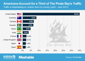
This chart shows the Top 10 traffic sources of The Pirate Bay, the world's most infamous piracy website.
More Information
Aug 5, 2013
Drug-related mortality rate per million people aged 15-64 in 2011.
More Information
Aug 1, 2013
This chart shows the untaxed overseas profits of U.S. tech companies 2012.
More Information
Jul 31, 2013
This chart shows the percentage of Americans who exercise for at least 30 minutes three or more days a week.
More Information
Jul 30, 2013
This chart shows railway accident fatalities in the US and in the EU from 1990 to 2012.
More Information
Jul 29, 2013
This chart shows greenhouse gas emissions in the EU and US from 1990 to 2011 (in million tons)
More Information
Jul 25, 2013
This chart shows carbon dioxide emissions from the top 10 fossil fuel burning countries in 2012 (in million tons).
More Information
Jul 23, 2013
This chart shows the percentage of Americans very/fairly closely following the story of the royal birth by age
More Information
Jul 22, 2013
This chart shows the U.S. daily revenue estimate for the top grossing iOS games.
More Information
Jul 18, 2013
This chart shows the immense growth of online video ads in the United States.
More Information
Jul 12, 2013
This chart shows the response to the question “are you worried about not being able to pay medical bills in the case of serious illness/accident?”
More Information
Jul 9, 2013
This chart shows the results of a survey among 2,048 Americans regarding their primary news source.
More Information
Jul 8, 2013
This chart illustrates countries with the highest amount of fatal civil aviation accidents since 1945.
More Information
Jul 4, 2013
This chart shows the Top 10 Pay TV markets in the world, based on the number of Pay TV households.
More Information
Jul 2, 2013
This chart illustrates the top global banks based on Tier 1 Capital
More Information
Jul 1, 2013
This chart shows a regional breakdown of traffic on Twitter.com in the past three months. 22.9% of Twitter's traffic comes from the...
More Information
Jun 28, 2013
This chart shows a comparison of the amount of Walmart outlets at home and abroad in 2013.
More Information
Jun 27, 2013
This chart shows the largest charities in the United States in 2012 by donations received.
More Information
Jun 26, 2013
This chart shows the ten fastest growing ad spenders among the Top 100 advertisers in the United States in 2012.
More Information
Jun 26, 2013
This chart shows Americans' views on the leak of classified NSA information and Edward Snowden's prosecution
More Information
Jun 25, 2013
This chart shows the largest solar markets in the United States in 2012.
More Information
Jun 25, 2013
This charts shows how American tablet and smartphone owners use their devices while watching TV.
More Information
Jun 24, 2013
This chart shows the percentage of the population that accesses online news by smartphone and tablet in selected countries.
More Information
Jun 24, 2013
This chart shows construction expenditure in American cities in 2013 from January to May 2013.
More Information
Jun 21, 2013
This chart shows global investment in renewable energy in developed and developing countries.
More Information
Jun 21, 2013
This chart illustrates the willingness to pay for digital news content in seven countries including the United States, Germany and...
More Information
Jun 20, 2013
This chart compares weekly prices of print newspaper subscriptions in the United States with the prices of digital subscriptions.
More Information
Jun 20, 2013
This chart provides a survey on Germany's perspective on various world leaders.
More Information
Jun 19, 2013
This chart shows the countries with the most millionaires in 2011 and 2012
More Information
Jun 18, 2013
This chart shows the results of a June 2013 survey among 512 Germans regarding their trust in the ability of German Chancellor Angela...
More Information
Jun 18, 2013
The chart provides a survey on Germany's favorite U.S. president.
More Information
Jun 14, 2013
This chart shows what kind of devices Americans prefer to stream music on.
More Information
Jun 14, 2013
This chart shows sales of domestic and imported hybrid vehicles in the United States from 1999 to 2012.
More Information
Jun 13, 2013
This chart shows computer and video game sales in the United States from 2009 through 2012, both on a unit and dollar basis.
More Information
Jun 12, 2013
This chart shows a digital ad spending forecast for the United States until 2017. eMarketer expects desktop ad spending to peak in...
More Information
Jun 12, 2013
This chart shows the number of user data requests by law enforcement agencies that Google received between June 2009 and December 2012.
More Information
Jun 12, 2013
This chart shows Americans' views on NSA phone and email monitoring as acceptable anti-terror tactics in June 2013
More Information
Jun 11, 2013
This chart compares the top dog breeds registered in the United States in 2002 and 2012.
More Information
Jun 11, 2013
This chart shows launch prices of selected video game consoles in the United States, both at current prices and in 2013 dollars.
More Information
Jun 10, 2013
This chart shows the pay levels of chief executives in the United States between 1989 and 2012
More Information
Jun 6, 2013
This chart shows estimated consumer book sales in the United States from 2008 through 2017.
More Information
Jun 4, 2013
This infographic illustrates the population increase in America's ten fastest growing cities from July 1, 2011 to July 1, 2012.
More Information
Jun 3, 2013
This chart shows that women are leading men in terms of social media adoption in the United States.
More Information
May 30, 2013
This chart shows the percentage of time spent using media in the U.S. and China 2012.
More Information
May 22, 2013
This chart illustrates how gaming consoles are used in the United States.
More Information
May 13, 2013
This chart shows eBook sales as a percentage of trade publishers' net revenue in the United States.
More Information
May 6, 2013
This chart illustrates how the use of mobile phones in the United States has changed between 2005 and 2012.
More Information
Apr 8, 2013
This chart shows the market share of leading smartphone platforms in the United States from January 2011 through February 2013.
More Information
Apr 5, 2013
This chart illustrates how Facebook users in the United States are shifting their use of the service from PCs to smartphones, while...
More Information
Apr 2, 2013
This chart shows the digital share of recorded music sales in the world's largest music markets.
More Information
Mar 28, 2013
This chart shows estimates for Twitter’s ad revenue from 2011 through 2015.
More Information
Mar 25, 2013
This chart shows the world’s largest movie markets, based on 2012 box office revenue.
More Information
Mar 22, 2013
This chart ranks popular cloud media services by their reach among American internet users.
More Information
Mar 21, 2013
The chart shows the number of watched videos on selected U.S. online video content properties.
More Information
Mar 18, 2013
The chart shows the number of U.S. Mobile, Online Casual and Social Gamers 2010 - 2014 .
More Information
Mar 8, 2013
This chart illustrates the problem behind Pandora's business model: the company's content acquisition costs grow quicker than its revenue....
More Information
Mar 6, 2013
This chart shows the organic revenue growth of the 'Big Four' advertising holding companies from 2010 to 2012.
More Information
Mar 5, 2013
This chart shows ranks the top six smartphone markets, based on their share of global unit shipments.
More Information
Feb 22, 2013
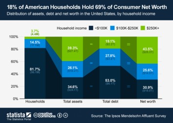
This chart nicely illustrates the distribution of assets, debt and net worth in the United States, by household income.
More Information
Feb 21, 2013
This chart shows the share of consumer technology revenues grabbed by the top 5 vendors in the United States.
More Information
Feb 20, 2013
This chart shows lobbying expenditure of tech companies in the United States in 2012.
More Information
Feb 19, 2013
This chart shows consumer spending on video games in the United States in 2011 and 2012.
More Information
Feb 18, 2013
This chart nicely illustrates the rise of social networking across all age groups in the United States.
More Information
Feb 15, 2013
This chart shows the percentage of retail e-commerce dollars spent via mobile devices in the United States.
More Information
Feb 13, 2013
This chart shows the year-over-year growth of Apple’s 9.7-inch iPad sales as estimated by Citi analysts based on IDC data.
More Information
Feb 11, 2013
This chart shows the length of the past ten papacies. On February 11, 2013, Benedict XVI announced his resignation due to health concerns....
More Information
Feb 11, 2013
This chart shows AOL's revenue growth since the first quarter of 2008. In the fourth quarter of 2012, the former internet heavyweight...
More Information
Feb 7, 2013
This chart shows the net income of America's most profitable companies in the quarter ended December 31, 2012.
More Information
Feb 6, 2013
This chart shows the number of online buyers in selected countries in 2012.
More Information
Feb 5, 2013
This chart shows TV viewership of Super Bowl broadcasts in the United States from 1990 to 2013. Super Bowl XLVII reached an average...
More Information
Feb 5, 2013
This chart illustrates consumer awareness and usage of digital wallet services in the United States.
More Information
Feb 4, 2013
This chart shows the Top 10 apps for Android and iOS devices in the United States, based on unique users (18+) in December 2012.
More Information
Jan 21, 2013
This chart shows the free storage offered by popular cloud storage services.
More Information
Jan 14, 2013
This chart shows the results of a survey among 11,000 consumers across 11 countries regarding their expected expenditure on consumer...
More Information
Jan 11, 2013
The chart shows retail mobile commerce sales in the U.S.
More Information
Jan 10, 2013
The chart shows digital music sales in the U.S. by genre.
More Information
Jan 9, 2013
The chart shows the percentage of U.S. consumers, who are likely to buy the following products in 2013.
More Information
Dec 20, 2012
This chart shows estimated mobile advertising revenues of the largest mobile ad selling companies in the United States. Google, Facebook...
More Information
56
/
57
Contact
Get in touch with us. We are happy to help.
Do you still have questions?
Feel free to contact us anytime using our
contact form
or visit our
FAQ page
.
Your contact to the Infographics Newsroom
Felix Richter
Data Journalist
felix.richter@statista.com
+49 (40) 284 841 557