Skip to main content
Consumer Goods & FMCG
E-Commerce
Economy & Politics
Energy & Environment
Health, Pharma & Medtech
Internet
Media
Technology & Telecommunications
Transportation & Logistics
Travel, Tourism & Hospitality
View all industries
Global data volume growth
Global AI market size
Number of generative AI users worldwide
Global inflation rate
Retail e-commerce sales worldwide
Largest economies worldwide
Biggest social media platforms by users
Global EV market share by manufacturer
International tourist arrivals by world region
Global annual CO₂ emissions
Browse recent statistics
Artificial intelligence (AI) worldwide
TikTok
Nvidia
E-commerce worldwide
Global GDP
Instagram
Apparel market worldwide
Video gaming worldwide
Global renewable energy industry
Influencer marketing worldwide
Browse recent topics
Consumer Trends 2026
Artificial Intelligence: in-depth market analysis
E-commerce challenges
Global economy
TikTok
Luxury goods: in-depth market analysis
Electric vehicles: A global overview
Video gaming worldwide
Travel and tourism trends 2026
Battery recycling worldwide
Browse recent reports
Consumer Insights
Advertising & Media
eCommerce
Consumer
Finance
Global Indicators
Health
Industrial
Mobility
Technology
Explore Market Insights
eCommerce Insights
Research AI
Book a demo
All integrations
Developer docs
Explore Statista Connect
Research
Strategy & Consulting
Marketing
Media & PR
Explore AI assistants
Marketing
Research & Development
Strategy
Sales
Find the fact
Tell the story
Win the pitch
Understand the market
Develop your strategy
Academia
Agencies
Consultancies
Consumer goods
Finance
Tech
Research solutions
Strategy consulting
Communication services
Explore Statista+
Statista R
Statista Healthcare
About Statista
First steps & help center
Webinar & training hub
Success stories
Individuals & Small Teams
Businesses & Enterprises
Academia & Government
English
Deutsch
Daily Data
Infographics on the topic """
Nov 20, 2015
This chart shows the percentage of inhabitants with an unfavourable/favourable view of Isis in 2015.
More Information
Nov 19, 2015
This chart shows passport prices and minimum wage hours required to buy one in 2015.
More Information
Nov 19, 2015
This chart shows the population without improved sanitation by region and year.
More Information
Nov 19, 2015
This chart shows index rankings of terrorism's impact across the world in 2014.
More Information
Nov 18, 2015
This chart shows the estimated operating profit share of leading smartphone vendors.
More Information
Nov 18, 2015
This chart shows the estimated number of foreign fighters per capita in 2015 (per million people).
More Information
Nov 16, 2015
This chart shows the percentage of global millennials ranking each of the following benefits first.
More Information
Nov 16, 2015
This chart shows the number of requests for user data and percentage granted.
More Information
Nov 16, 2015
This chart shows index rankings of the most affordable cities worldwide for students in 2015.
More Information
Nov 13, 2015
This chart shows the number of languages worldwide and online in 2012 and 2015.
More Information
Nov 13, 2015
This chart shows the number of government requests for Facebook user data in the first half of 2015.
More Information
Nov 13, 2015
This chart shows CPS prosecutions for cases flagged as rape in England and Wales in 2014/15.
More Information
Nov 12, 2015
This chart shows countreis ranked by number of regional craft breweries in 2015.
More Information
Nov 12, 2015
This chart shows recorded burglary offences by quarter in Ireland in 2014.
More Information
Nov 10, 2015
This chart shows average U.S. monthly banking uses from 2011 to 2014.
More Information
Nov 9, 2015
This chart shows countries the Foreign Office advises against visiting in 2015.
More Information
Nov 9, 2015
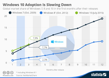
This chart illustrates the adoption of Windows 7, 8 and 10 in the first months after their respective releases.
More Information
Nov 9, 2015
This chart shows global crimes against journalists visualised.
More Information
Nov 6, 2015
This chart shows the number of gardaí stationed in border counties in the Republic of Ireland in 2010 and 2015.
More Information
Nov 5, 2015
This chart shows the percentage of Americans who say they believe in God, pray daily or attend church services once a week.
More Information
Nov 4, 2015
This chart shows the economic impact of violence/conflict to the world economy (in trillion U.S. dollars).
More Information
Nov 3, 2015
This chart shows commercial aviation accidents and fatalities per country since 1945.
More Information
Nov 3, 2015
This chart shows the concentration of different languages by local authority in England and Wales in 2011.
More Information
Nov 2, 2015
This chart shows the three most important social networks to teens in the United States.
More Information
Nov 2, 2015
This chart shows all the numbers behind crime in Ireland in 2014.
More Information
Nov 2, 2015
This chart shows the best and worst places in the UK to make a living
More Information
Oct 30, 2015
This chart shows annual beef & veal consumption per capita in OECD countries in 2014.
More Information
Oct 30, 2015
This chart shows year-over-year growth of worldwide tablet shipments.
More Information
Oct 30, 2015
This chart shows personality traits described by 18-34 year old smokers compares to non-smokers.
More Information
Oct 30, 2015
This chart gives all the numbers behind Halloween 2015 in the United States.
More Information
Oct 29, 2015
This chart shows municipal waste generation in selected OECD countries in 2013 (kg per capita).
More Information
Oct 28, 2015
This chart shows Apple's revenue, net income, market capitalization and brand value in 2005 and 2015.
More Information
Oct 28, 2015
This chart shows vital Irish statistics from 2014.
More Information
Oct 28, 2015
This chart shows self-employed people as a percentage of U.S. industry employment in 2014.
More Information
Oct 28, 2015
This chart shows the percent of the population having an affair in British towns in 2015.
More Information
Smart Home
Oct 27, 2015
This chart shows the estimated number of smart homes in the five largest markets for smart home technology.
More Information
Oct 27, 2015
This chart shows responses to the question "what is the most producitive length of a working day?"
More Information
Oct 27, 2015
This chart shows female dollar billionaires and total wealth by country in 2015.
More Information
Oct 27, 2015
This chart shows emigrants from Ireland living in other countries in 2013.
More Information
Oct 27, 2015
This chart shows British national deaths abroad requiring British consular assistance in 2014/2015.
More Information
Oct 26, 2015
This chart shows the annual average cost to rent a square foot of prime office space in 2015.
More Information
Oct 22, 2015
This chart shows household net worth across countries in the 4 years up to Q1 2015 (Euro per capita).
More Information
Oct 22, 2015
This chart shows the world's most valuable startups as of October 2015
More Information
Oct 22, 2015
This chart shows key numbers behind selected major economies in September 2015.
More Information
Oct 21, 2015
This chart shows opinion on the most productive length of a working day in the U.S.
More Information
Oct 20, 2015
This chart shows the direct economic impact from the UAV industry in the United States.
More Information
Oct 20, 2015
This chart shows the cheapest price for a match day ticket at selected football clubs for the 2015-16 season.
More Information
Oct 19, 2015
This chart shows money held offshore by U.S. companies in 2015 (in billion U.S. dollars).
More Information
Oct 19, 2015
This chart shows how quickly the new iPhone models were adopted in the 12 launch markets.
More Information
Oct 19, 2015
This chart shows the price of a 2015-2016 season adult shirt at European football clubs.
More Information
Oct 16, 2015
This chart shows the average cost of a three-mile taxi trip in selected global cities in 2015.
More Information
Oct 16, 2015
This chart shows the top 15 cities worldwide by GDP in 2030.
More Information
Oct 15, 2015
This chart shows the index rankings of the world's top 15 most globalised nations.
More Information
Oct 15, 2015
This chart shows countries and territories ranked on perceived public sector corruption in 2014.
More Information
Oct 15, 2015
This chart shows the top 10 jobs that attract the most psychopaths.
More Information
Oct 15, 2015
This chart shows the financials behind the mobile payments company Square.
More Information
Oct 14, 2015
This chart shows how much money U.S. tech companies hold in offshore subsidiaries to avoid U.S. taxes.
More Information
Oct 14, 2015
This chart shows the countries with the most unemployed graduates.
More Information
Oct 13, 2015
This chart shows global youth unemployment and the unemployment rate.
More Information
Oct 12, 2015
This chart shows the value of selected tech company acquisitions.
More Information
Oct 12, 2015
This chart shows the number of properties valued at $5+ million sold in 2009 and 2014.
More Information
Oct 9, 2015
This chart shows the estimated number of foreign fighters in Iraq/Syria from selected countries in 2015.
More Information
Oct 7, 2015
This chart shows the percentage of people who have one or more of these devices at home in 2015.
More Information
Oct 7, 2015
This chart shows the top five origin countries of British immigrants from 1951 to 2011.
More Information
Oct 6, 2015
This chart illustrates how Google searches for the keyword combination “iPhone slow” tend to peak right after Apple introduces a new...
More Information
Oct 6, 2015
This chart shows the countries with the most attacks on aid workers from 2004 to 2014.
More Information
Oct 6, 2015
This chart shows responses to the question "How close is the Labour/Conservative party to the following groups in society".
More Information
Oct 5, 2015
This chart breaks down U.S. music industry revenues by type of distribution.
More Information
Oct 5, 2015
This chart shows deaths from terrorism and gun homicide in the United States from 2001 to 2011.
More Information
Oct 2, 2015
This chart shows homicide deaths per 100,000 of the population (2010-2012 average).
More Information
Oct 2, 2015
This chart shows the data used to load mobile news wesites.
More Information
Oct 2, 2015
This chart shows deaths from terrorism and gun homicide in the United States from 2001 to 2011.
More Information
Oct 1, 2015
This chart shows the percentage of Americans/Germans who trust the following American/European standards.
More Information
Sep 30, 2015
This chart shows the percentage who say immigrants make a country stronger /are a burden on a country.
More Information
Sep 30, 2015
This chart shows launch weekend sales from the launch of the iPhone 3G in 2008 to the most recent launch of the iPhone 6s and 6s Plus.
More Information
Sep 29, 2015
This chart provides key information about video streaming.
More Information
Sep 29, 2015
This chart shows revenue collected by top U.S. toll agencies in 2013.
More Information
Sep 28, 2015
This chart show the adult obesity rate per U.S. state in 2014.
More Information
Sep 28, 2015
This chart shows responses to the question: "is corruption widespread throughout the government in this country, or not?" (%)
More Information
Sep 25, 2015
This chart shows the top-10 movies with the most mistakes in history.
More Information
Sep 24, 2015
This chart shows emergency relocation of refugees from Italy, Greece and Hungary throughout the EU.
More Information
Sep 24, 2015
This chart shows the average hours of working time required to buy an iPhone 6 (16GB) in selected cities.
More Information
Sep 23, 2015
This chart shows global population growth with a forecast up to 2100.
More Information
Sep 22, 2015
This chart shows how much time Americans spend using mobile apps vs. using mobile websites.
More Information
Sep 22, 2015
This chart shows the number of pilgrims attending the hajj.
More Information
Sep 21, 2015
This chart shows the average download speed in European capital cities in January 2015.
More Information
Sep 21, 2015
This chart shows the projected regional and total economic impact of the 2015 Rugby World Cup.
More Information
Sep 21, 2015
This chart shows the players who have scored the most points in Rugby World Cup history.
More Information
Sep 21, 2015
This chart shows the HNWI population from 2009 to 2014.
More Information
Sep 18, 2015
This chart shows the EU countries that have approved asylum applications at a higher/lower rate than the quota.
More Information
143
/
160
Contact
Get in touch with us. We are happy to help.
Do you still have questions?
Feel free to contact us anytime using our
contact form
or visit our
FAQ page
.
Your contact to the Infographics Newsroom
Felix Richter
Data Journalist
felix.richter@statista.com
+49 (40) 284 841 557