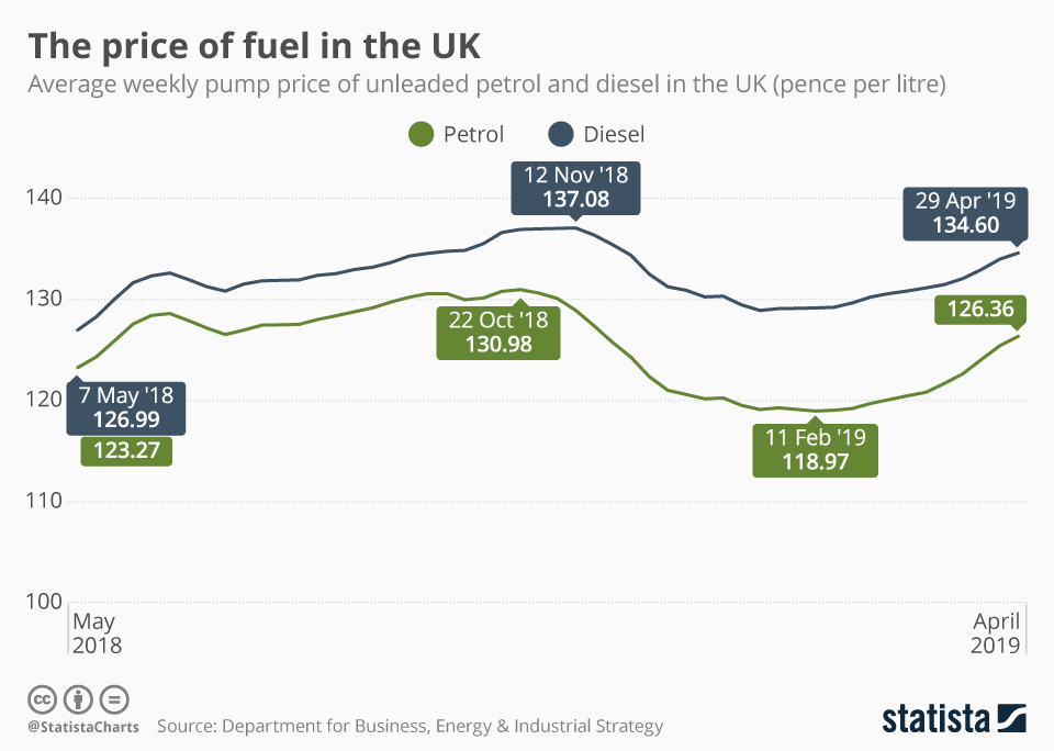
If you own a vehicle, you likely keep a close eye on the ups and downs of pump prices, ready to pounce when they drop by a penny or two. This infographic won't tell you the best time to fuel up next, but it does offer an interesting look back at how the average prices have developed over the last twelve months. Government statistics show that the current trend is on an upward trajectory. The highest prices in the last year came around October/November, when the average litre of petrol and diesel cost 131 and 137 pence, respectively.
Mobility
The price of fuel in the UK

Description
This chart shows the average weekly pump price of unleaded petrol and diesel in the UK in 2018/19.