Skip to main content
Consumer Goods & FMCG
E-Commerce
Economy & Politics
Energy & Environment
Health, Pharma & Medtech
Internet
Media
Technology & Telecommunications
Transportation & Logistics
Travel, Tourism & Hospitality
View all industries
Global data volume growth
Global AI market size
Number of generative AI users worldwide
Global inflation rate
Retail e-commerce sales worldwide
Largest economies worldwide
Biggest social media platforms by users
Global EV market share by manufacturer
International tourist arrivals by world region
Global annual CO₂ emissions
Browse recent statistics
Artificial intelligence (AI) worldwide
TikTok
Nvidia
E-commerce worldwide
Global GDP
Instagram
Apparel market worldwide
Video gaming worldwide
Global renewable energy industry
Influencer marketing worldwide
Browse recent topics
Consumer Trends 2026
Artificial Intelligence: in-depth market analysis
E-commerce challenges
Global economy
TikTok
Luxury goods: in-depth market analysis
Electric vehicles: A global overview
Video gaming worldwide
Travel and tourism trends 2026
Battery recycling worldwide
Browse recent reports
Consumer Insights
Advertising & Media
eCommerce
Consumer
Finance
Global Indicators
Health
Industrial
Mobility
Technology
Explore Market Insights
eCommerce Insights
Research AI
Book a demo
All integrations
Developer docs
Explore Statista Connect
Research
Strategy & Consulting
Marketing
Media & PR
Explore AI assistants
Marketing
Research & Development
Strategy
Sales
Find the fact
Tell the story
Win the pitch
Understand the market
Develop your strategy
Academia
Agencies
Consultancies
Consumer goods
Finance
Tech
Research solutions
Strategy consulting
Communication services
Explore Statista+
Statista R
Statista Healthcare
About Statista
First steps & help center
Webinar & training hub
Success stories
Individuals & Small Teams
Businesses & Enterprises
Academia & Government
English
Deutsch
Daily Data
Infographics on the topic "media"
May 15, 2014
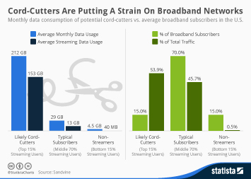
This chart compares the monthly data consumption of potential cord-cutters with that of average broadband subscribers in the United...
More Information
May 6, 2014
This chart shows the reach of social networks among Americans aged 18 to 29 years.
More Information
Apr 29, 2014
This chart illustrates that Twitter's user growth is decelerating rather quickly.
More Information
Apr 23, 2014
This chart shows the growth of average time spent per day with major media by U.S. adults.
More Information
Apr 23, 2014
This chart shows the share of time spent per day with major media by U.S. adults.
More Information
Apr 7, 2014
This chart shows the percentage of time spent on social networks in the United States, by platform.
More Information
Mar 31, 2014
This chart shows the proportion of time users of social networks spent on mobile devices and desktop PCs.
More Information
Mar 28, 2014
This chart illustrates how many people use social networks to get news.
More Information
Mar 26, 2014
This chart shows the motivation behind brands' use of Twitter as a marketing tool.
More Information
Mar 23, 2014
This chart shows the results of a Socialbakers survey among 500+ marketers regarding their company’s adoption of social networks as...
More Information
Mar 20, 2014
This chart shows that brands shouldn’t overdo it with hashtags when they post something on Facebook.
More Information
Mar 18, 2014
This chart shows the percentage of small businesses using the following in 2013.
More Information
Mar 13, 2014
This chart shows the average time millennials in the U.S. spend interacting with media per day.
More Information
Feb 12, 2014
This chart shows how long Americans are using Facebook and Twitter on different platforms.
More Information
Jan 22, 2014
This chart shows the companies that received the most media coverage in 2013. Dow Jones tracks English-language print publications...
More Information
Jan 16, 2014
This chart illustrates how young Americans are apparently losing interest in facebook. Since January 2011, the number of users aged...
More Information
Jan 14, 2014
This chart shows the percentage of respondents saying that “married people having an affair is morally unacceptable”.
More Information
Jan 13, 2014
This chart shows the football players with the most Ballon d’Or awards.
More Information
Dec 12, 2013
This chart illustrates that online video consumption greatly varies across different age groups. Younger adults are much more likely...
More Information
Dec 10, 2013
This chart shows the 10 cities with the highest estimated spending on anti-ACA advertising in 2013.
More Information
Dec 5, 2013
While experts are busy arguing about when traditional TV should officially be declared dead, people continue to do what they have always...
More Information
Dec 4, 2013
This chart shows the Pay-TV services American adults from different age groups subscribe to. While the majority of those aged 49 and...
More Information
Dec 3, 2013
This chart illustrates the age structure of social networks in the United States. 50% of Twitter's unique visitors in October 2013...
More Information
Dec 2, 2013
This chart displays the main reasons offline adults in the states don't use the internet.
More Information
Nov 26, 2013
This chart shows worldwide coverage and the percentage increase in tobacco control policies.
More Information
Nov 25, 2013
They text, they tweet, they share whatever they do online. No generation before them has grown up as connected as today's teenagers....
More Information
Nov 20, 2013
This chart provides a geographic breakdown of Twitter's active user base. 24 percent of Twitter's users who actually tweet are located...
More Information
Nov 19, 2013
Social networks such as Twitter and Facebook are not only used to connect with friends and acquaintances, but also to stay on top of...
More Information
Nov 11, 2013
If you are a regular user of Twitter or Facebook chances are you have seen your fair share of videos and photos featuring cute/cuddly/grumpy...
More Information
Nov 6, 2013
We all interact with different kinds of media all day every day. But for most of us, it hasn't always been this way. Today's children...
More Information
Nov 1, 2013
This chart shows which social networks drive the most traffic to websites.
More Information
Oct 28, 2013
This chart shows that, despite all the functionality added over the years, people still use Facebook for the same reason that it was...
More Information
Oct 25, 2013
The Ellen Show is the most-followed brand on Instagram. According to analytics firm <a href="http://nitrogr.am ">Nitrogram</a>, the...
More Information
Oct 24, 2013
Facebook is no longer the most popular social network among American teens. According to Piper Jaffray's biannual survey among thousands...
More Information
Oct 23, 2013
Does Twitter have a quitter problem? Ahead of its IPO, scheduled for November, the company finds itself confronted with research that...
More Information
Oct 11, 2013
There's one simple reason why Facebook remains the most important social platform for brand marketers: reach. Coca-Cola, the no. 1...
More Information
Sep 17, 2013
The music industry is two steps ahead of other industries in the ongoing digitization of media distribution. Download and streaming...
More Information
Sep 5, 2013
Despite the ongoing debate surrounding online privacy, surveillance and data abuse, Americans continue to share a lot of information...
More Information
Sep 4, 2013
This chart shows smartphone platform market share figures for the United States, China and the EU5 countries (UK, Germany, France,...
More Information
Aug 23, 2013
This chart illustrates how brands are increasingly adopting Twitter to get their message across.
More Information
Aug 19, 2013
This chart shows the 10 most talked-about brands on Facebook as of August 19, 2013.
More Information
Aug 16, 2013
This chart shows which social networks are the most popular ones among American teenagers.
More Information
Aug 14, 2013
This charts illustrates how much time on average Americans spend with different online activities each day.
More Information
Aug 6, 2013
This chart shows the average weekday and Sunday circulation of The Washington Post from 2004 to 2013.
More Information
Aug 6, 2013
This chart shows the average daily circulation at the Top 10 U.S. newspapers between October 2012 and March 2013.
More Information
Aug 6, 2013
This chart illustrates the growing adoption of social networking by adult internet users in the United States.
More Information
Aug 5, 2013
This chart shows how much time Americans interact with different media on an average day.
More Information
Aug 5, 2013
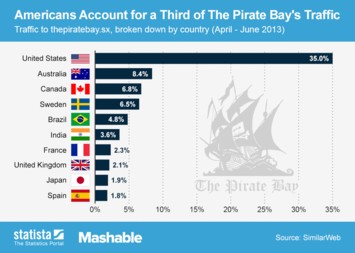
This chart shows the Top 10 traffic sources of The Pirate Bay, the world's most infamous piracy website.
More Information
Jul 26, 2013
This chart shows the percentage of traffic on American news websites that comes from social media sites.
More Information
Jul 23, 2013
This chart shows the percentage of Americans very/fairly closely following the story of the royal birth by age
More Information
Jul 9, 2013
This chart shows the results of a survey among 2,048 Americans regarding their primary news source.
More Information
Jul 1, 2013
This chart shows a regional breakdown of traffic on Twitter.com in the past three months. 22.9% of Twitter's traffic comes from the...
More Information
Jun 25, 2013
This charts shows how American tablet and smartphone owners use their devices while watching TV.
More Information
Jun 24, 2013
This chart shows the percentage of the population that accesses online news by smartphone and tablet in selected countries.
More Information
Jun 21, 2013
This chart illustrates the willingness to pay for digital news content in seven countries including the United States, Germany and...
More Information
Jun 18, 2013
This chart shows the estimated number of monthly active social network users around the world.
More Information
Jun 17, 2013
This chart shows a forecast of global ad revenues in 2013, broken down by advertising medium.
More Information
Jun 14, 2013
This chart shows what kind of devices Americans prefer to stream music on.
More Information
Jun 12, 2013
This chart shows a digital ad spending forecast for the United States until 2017. eMarketer expects desktop ad spending to peak in...
More Information
Jun 6, 2013
This chart shows estimated consumer book sales in the United States from 2008 through 2017.
More Information
Jun 5, 2013
This chart shows changes in newspaper circulation and advertising revenue between 2008 and 2012.
More Information
Jun 3, 2013
This chart shows that women are leading men in terms of social media adoption in the United States.
More Information
May 30, 2013
This chart shows the percentage of time spent using media in the U.S. and China 2012.
More Information
May 24, 2013
This chart illustrates Amazon's long-term growth from 1997 through 2012.
More Information
May 21, 2013
This chart illustrates Tumblr's exponential growth since its launch in February 2007.
More Information
May 16, 2013
This chart shows the global penetration of the world's ten largest social media sites.
More Information
May 15, 2013
This chart illustrates the distribution of Tweets among Twitter users. The chart is based on 1,535,929,521 Tweets from 71,273,997 unique...
More Information
May 13, 2013
This chart shows eBook sales as a percentage of trade publishers' net revenue in the United States.
More Information
Apr 26, 2013
This chart shows the New York Times' digital subscriber growth.
More Information
Mar 22, 2013
This chart ranks popular cloud media services by their reach among American internet users.
More Information
Mar 20, 2013
The chart shows the year-over-year audience growth of U.S. news media in 2011 and 2012.
More Information
Feb 18, 2013
This chart nicely illustrates the rise of social networking across all age groups in the United States.
More Information
Feb 11, 2013
This chart shows AOL's revenue growth since the first quarter of 2008. In the fourth quarter of 2012, the former internet heavyweight...
More Information
Feb 4, 2013
This chart illustrates Facebook's blockbuster user growth. The social network was launched 9 years ago in February 2004 and reached...
More Information
Dec 19, 2012
This chart illustrates the adoption of social media channels by U.S. ad agencies. 82.4 percent of the responding agencies were using...
More Information
Dec 6, 2012
This chart shows the average time Americans spend interacting with different media in the United States (in minutes per day).
More Information
Dec 3, 2012
The chart shows the worldwide expenditure for internet and print advertising until 2015.
More Information
Nov 23, 2012
This chart shows a forecast of digital media usage in the United States in 2013.
More Information
Nov 12, 2012
This chart shows Google's advertising revenue since 2004 compared to print ad revenues of U.S. newspapers and magazines.
More Information
Nov 6, 2012
This chart shows the degree to which the pre-election coverage/discussion of Barack Obama and Mitt Romney in traditional and social...
More Information
Oct 17, 2012
This chart provides a nice overview of the international availability of digital content offerings of Apple, Google, Amazon and Microsoft.
More Information
Oct 16, 2012
This chart breaks down the average digital music collections of U.S. adults (P2P users and non-users), by file source. It shows that...
More Information
Oct 15, 2012
This chart shows the growth of online ad revenue and the simultaneous decline of newspaper advertising in the United States.
More Information
Oct 11, 2012
This chart shows that Google+ is far more popular in BRIC nations than it is in developed economies such as the United States, Japan...
More Information
Oct 8, 2012
This chart shows key metrics of social media channels as a source of e-commerce traffic. The averages are based on data from 689 million...
More Information
18
/
19
Contact
Get in touch with us. We are happy to help.
Do you still have questions?
Feel free to contact us anytime using our
contact form
or visit our
FAQ page
.
Your contact to the Infographics Newsroom
Felix Richter
Data Journalist
felix.richter@statista.com
+49 (40) 284 841 557